Editor Layout & Panels
The editor window is a toolbar, a canvas, and three panel slots around it. Which panel goes where is entirely your choice: any of the six panel types can be pinned to any slot, and the arrangement you settle on is remembered.
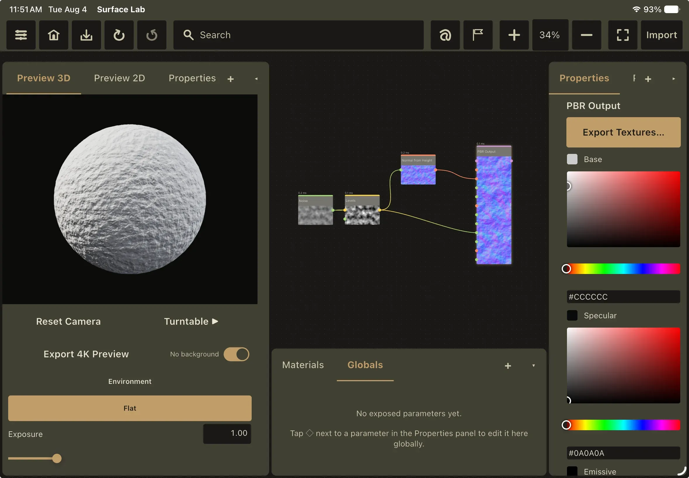
The toolbar
Section titled “The toolbar”A fixed strip across the top of the editor window: a single row of card buttons with the search field stretched across the middle, taking whatever width the buttons leave. Every button carries a screen-reader label and a minimum 44-point touch target.
Left of the search field
| Name | Behavior |
|---|---|
| Settings | Opens the Settings window |
| Back to Hub | Saves the current project (aborting the navigation if the save fails) and returns to the hub |
| Save | Saves the project. An accent pip in the button’s top-right corner means there are unsaved changes; no pip means saved |
| Undo | Undoes the last graph change. Grayed out and inert when there is nothing to undo |
| Redo | Redoes the last undone change. Grayed out and inert when there is nothing to redo |
The search field
Searches nodes and manual articles together. Covered in Interface Tour.
Right of the search field
| Name | Behavior |
|---|---|
| Annotation Mode | Toggles freehand annotation drawing. Stays lit while active |
| Toggle Minimap | Shows or hides the Node Map. Stays lit while visible |
| Zoom In | Multiplies the canvas zoom by 1.25 |
| Zoom field | Shows the canvas zoom as a whole percentage (124%) and accepts a typed value to jump to it |
| Zoom Out | Divides the canvas zoom by 1.25 |
| Focus Mode | Hides all panels and collapses the toolbar |
| Import | Native picker; the chosen file is embedded into the open project. Warns Open a project first. if nothing is open. The only button labeled with a word rather than an icon |
A button reads in the secondary text color at rest, brightens on hover and press, and switches to the accent color over an accent-tinted card while its mode is on. A disabled button (Undo or Redo with nothing to do) reads in the disabled color.
There is no Add Node button. Nodes come from the search field, the Node Picker panel, or a double-click on empty canvas.
In focus mode the whole strip collapses to a sliver of roughly 8 points, just enough to keep the canvas from drawing behind the OS menu bar. On iPad the toolbar’s content is pushed down by the status-bar safe area so the system clock never overlaps it.
Panel slots and panel types
Section titled “Panel slots and panel types”There are exactly three panel slots: left, right and bottom. The two side slots are full height; the bottom slot’s width is derived from whatever the sides leave.
Six panel types can be assigned to any slot. No panel type belongs to a particular slot; the assignments below are only the starting defaults.
| Tab label | Full name | What it shows |
|---|---|---|
| Node Picker | Node Picker / Asset Library | The searchable, taggable node library gallery |
| Properties | Properties Panel | Parameter editor for the selected node |
| Materials | Material / Asset Library | The project’s material list |
| Preview 2D | Texture Preview (2D) | Flat per-channel texture viewer |
| Preview 3D | Material Preview (3D PBR) | Real-time PBR-lit viewport |
| Globals | Project / Global Variables | Every parameter you have exposed |
All six render real content; there are no placeholder panels.
Defaults: Node Picker in the left slot, Properties in the right slot, Materials in the bottom slot.
Tabs, adding and removing views
Section titled “Tabs, adding and removing views”Each slot has a header containing a tab bar, a + button and a collapse chevron.
- Tapping a tab switches the active view instantly; the active tab is highlighted in the accent color.
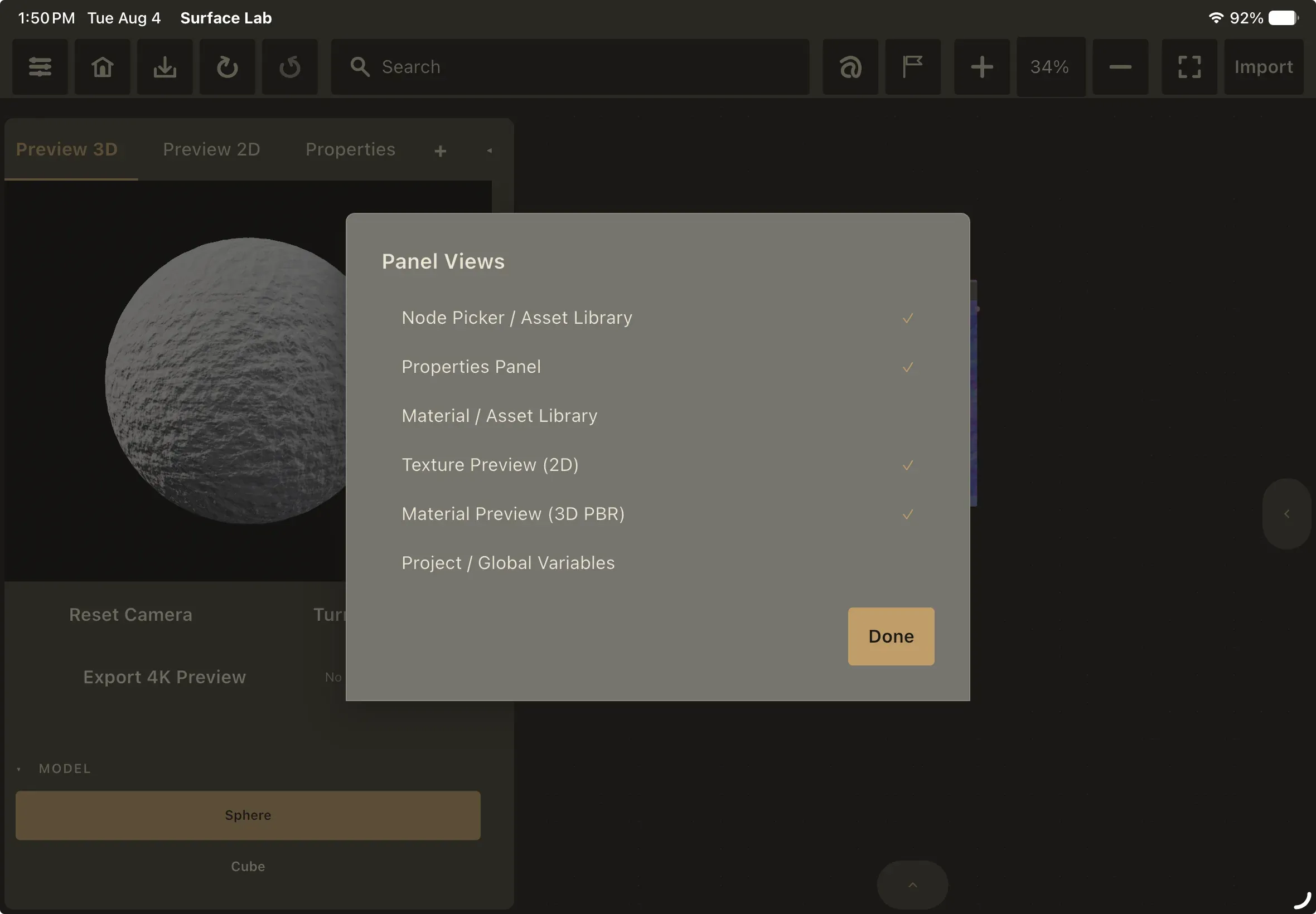
- + opens a Panel Views sheet listing all six types with a check mark beside the ones pinned to this slot. Tap to pin or unpin. The last remaining tab in a slot cannot be unpinned; its row is disabled.
- Removing the active tab moves the slot to the first remaining tab.
- The header tab bar scrolls if the tabs do not fit. On a very narrow panel the tab bar is dropped entirely and only the + and collapse controls remain.
Collapsing and focus mode
Section titled “Collapsing and focus mode”- The chevron at the right of a panel header collapses that slot. The keyboard equivalents are Ctrl/Cmd+←, Ctrl/Cmd+→ and Ctrl/Cmd+↓.
- A collapsed slot gives its entire area to the canvas; no strip is reserved. A small floating pill appears on the canvas-facing edge where the panel used to be, and tapping it expands the slot again.
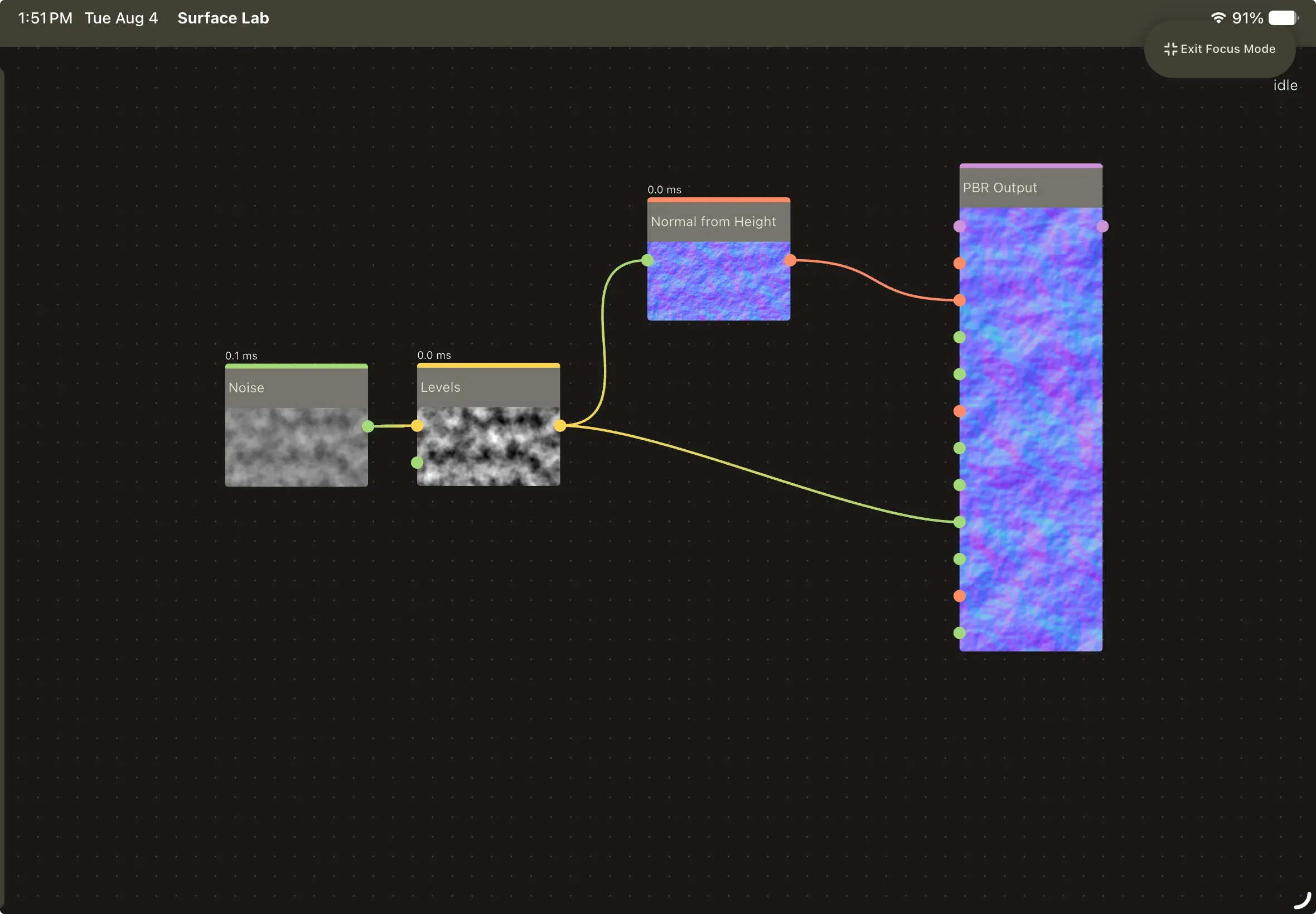
- Focus mode (Ctrl/Cmd+↑, or the Focus Mode toolbar button) slides all three panels out to their respective edges over about 200 ms and collapses the toolbar. A floating Exit Focus Mode pill at the top-right is the only interactive control left. Tapping it, or pressing the shortcut again, restores everything.
Resizing
Section titled “Resizing”Drag the handle on a panel’s inner edge. The panel tracks the pointer exactly, with no easing or animation, and snaps to a whole pixel when you release.
| Slot | Minimum | Maximum | Default |
|---|---|---|---|
| Left / Right | 10% of window width | 40% of window width | 22% |
| Bottom | 15% of window height | 50% of window height | 28% |
Sizes are stored as percentages of the window, so the layout scales sensibly when you move the window between monitors or resize it.
Persistence
Section titled “Persistence”There is one layout for all projects, per user. Slot assignments, the tab list for each slot, which tab is active, collapsed state and panel sizes are all saved immediately on every change and restored on every editor launch. If the stored layout is unreadable, the app silently falls back to the defaults above.